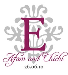
I did a post last year about our wedding monograms which I designed in PowerPoint! They were my first DIY project and I hoped to use them on our printed material.
Since then I have got a lot more familiar with Photoshop and decided to update our monograms, as the others I did felt a little stale.
Our invites are now finally on route to guests, so I present to you the 2010 editions…
This one went on our wedding invites
Haven’t made up my mind where I want to use this one
For the reception:
Fonts used:
Freebooter Script – our names in the last monogram
High Tower Text – all the main text
Fleurons {Dingbat} – for the image behind the ‘E’ in the last monogram. It is lower case ‘m’
Edwardian Script – for the swirly ‘E’
What do you think?


They look lovely!! Blessings on your wedding day...
ReplyDeleteSandy
I really like the last one for the reception. so beautiful! You're about a month away now!!! how do you feel?
ReplyDeleteI love it. It is super classy and elegant. You've got talent!
ReplyDeleteI really loved the second one! Its very elegant... wow
ReplyDeleteI love these! Now you're making me want to design my own monogram. You did a great job and I love the color combo.
ReplyDeleteAwesome! Creativity in action :)
ReplyDelete- LDP
Thanks for your feedback. The whole designing process has been a labour of love!
ReplyDelete@Kemi - A month I know! Can you believe it. So much to do, I don't know where the time has gone!
You are so incredibly talented! You may have a side business in the making.
ReplyDelete@GNG - Aww thanks. Who knows you might be onto something!
ReplyDeleteAlso: I'd like some photoshop tips and tricks pretty please! :)
ReplyDelete@GNG - drop me a line with what you need and I will see what I can do. :)
ReplyDelete